
Design Process
Here we will walk you through a simplified version of our design process to create AgeWell.


01
Ideation and Sketches
After we finished research and decided on our domain, we came up with three possible ideas for our app. Some of our initial ideas were:
-
An activity app to track health and exercise
-
An everyday journaling app for seniors
-
A healthcare journal for medications and symptoms
After fleshing out our ideas and determining specific features for each idea, we decided to go with the healthcare journal. To start the processall our group members did individual rough sketches to determine a few different designs for the app. When we all came to a consensus on the app design afterwards, we did some refined sketches to make sure we were all on the same page and to have a clear idea of our app

02
Lo-Fidelity Wireframes
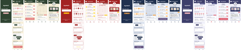
Based on the style guide we created with research as well as the needs and goals of our user persona, we created these wireframes and implemented our colour palette, button styles and text styles. The wireframes were not fully consistent and lacked the use of accent colours and looked very flat overall, so we ended up changing it. We made sure to test out layout in greyscale to ensure readability.


03
Colour Palette Change
After we had fully refined our wireframes to be consistent, we felt like something was off about our app, so we decided to play around with different colour palettes. In the end, we decided to go with one slightly darker than our original to make the app look more mature while improving readability and contrast
04
User Testing and Finalizing
After fully finishing our wireframes, we moved them into the prototyping app ProtoPie and started making it functional. We focused on making the main interactions perfect and then doing minor interactions last. With our working prototype, we invited 3 users aged above 60 to run user testing through think-aloud testing followed by interviews. We had the users run through a few tasks while they spoke their thoughts aloud, which helped us better grasp the users' thought processes going through the app. After the testing, we asked our users a couple of pre-set questions about their experience with the app. We analyzed our feedback via an affinity diagram to determine the problem areas and create solutions for them. The top three issues we found were as follows:
-
The reminders being fully displayed on two pages (the homepage and the reminders page) were found to be confusing and unnecessary. To fix this, we simplified the reminders on the homepage to only display titles so that the information on the homepage could be reduced and the reminders page would be more differentiable than the homepage.
-
After completing the onboarding, all our users found the homepage and its features to be confusing because they didn't know what to do and there was too much information on the home screen to process. To fix this issue, we added a feature tutorial after the onboarding to help users understand what they can do with the app. This feature is also skippable for users who don't need it. Reducing the reminders to just display titles also helped reduce the amount of information presented to the user.
-
The last issue was with our onboarding process. The users found that making some of the information mandatory to input right away might not be ideal for the user, and specifically for the email input it would be an issue if users didn't have an email address. To fix this, we added an option to skip information that could be added later, as well as provided an option for phone number or email for users who wish to sign up

To narrow down our results and determine the top three issues, we combined our findings from each interview in an affinity diagram (pictured below). This process allowed us to compare and contrast our results to determine common issues within the main features of the app that every interviewee experienced or commented on post-test.